Overview
Redesigning the company’s website for a modernized look, and to improve user experience, SEO, and overall execution.
Design Process
When redesigning the site, I originally went through the old website and found what needed to be updated and changed and looked for ways the site could improve, focusing on user experience and ease of navigation.
One of these major issues was the navbar, being overly cluttered with extra long dropdown tabs, making it difficult to find or see what you are looking for. The overall copy of the entire website was cluttered and redundant as well and some of the images were outdated. I took these issues along with the overall color palette of their brand to the CEO and pitched redesigning the website and revamping the color palette to brighter shades, giving a more inviting and modern feel.
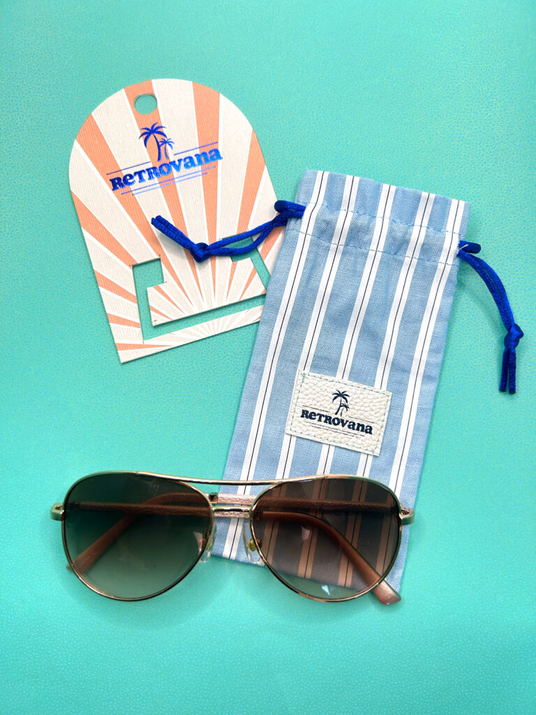
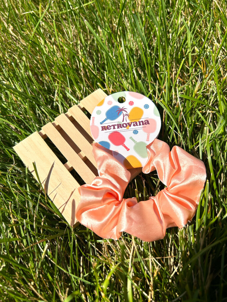
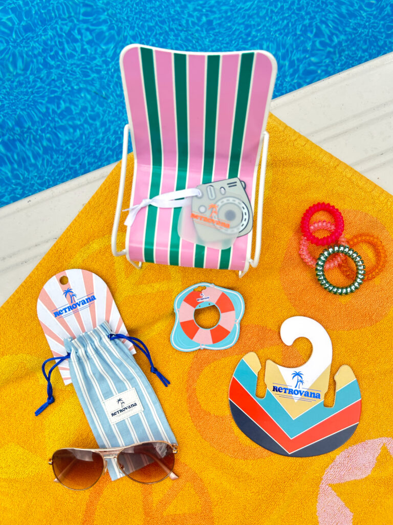
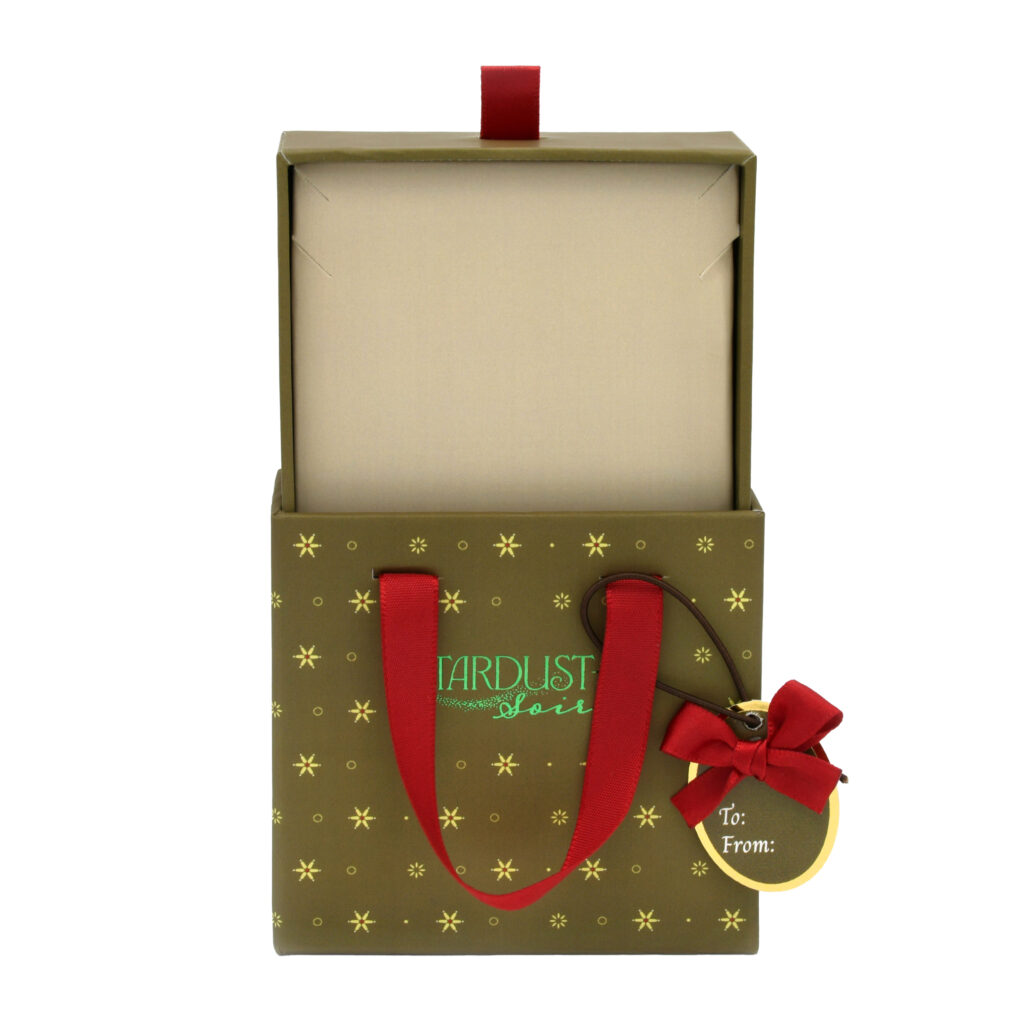
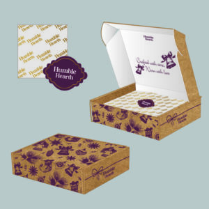
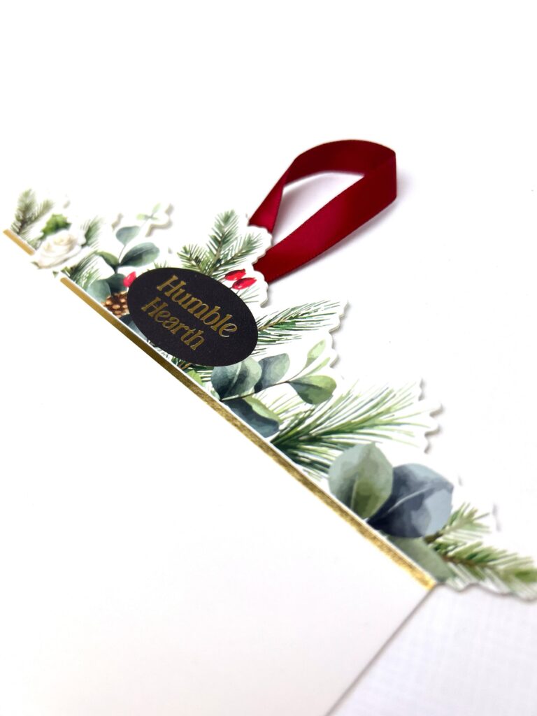
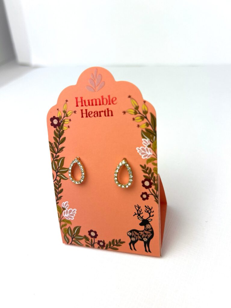
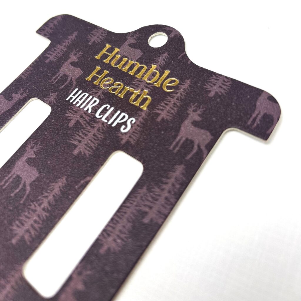
I went through the redesign page by page, changing almost everything. Primarily changing the colors, layouts, and reorganizing the copy along with condensing when necessary. The homepage was the largest part of this redesign as I came up with and added new sections to the website to best fit what the company needed to market and advertise such as sustainable packaging and the ability to create packaging in the U.S.
I also added an entire page for both of these sections as they are important factors for many businesses when it comes to product packaging, and having the information readily available on the website is important for customers and SEO purposes.
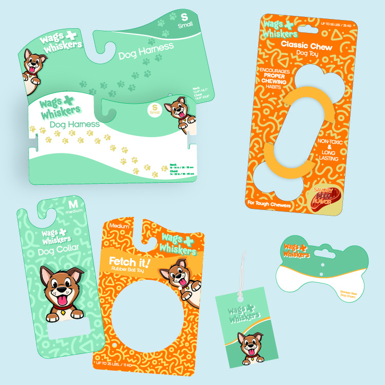
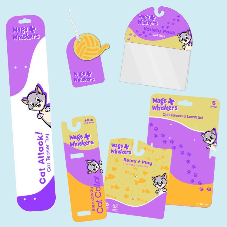
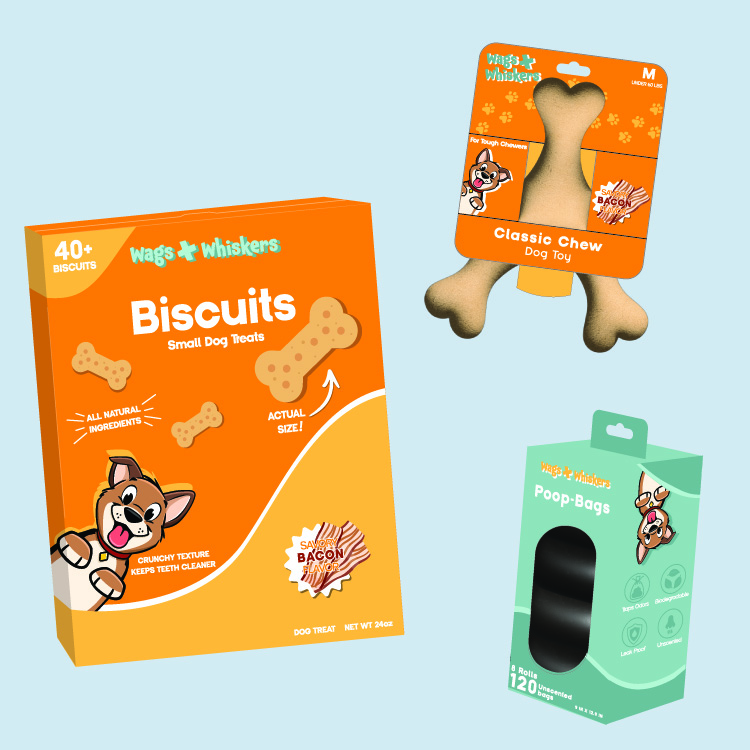
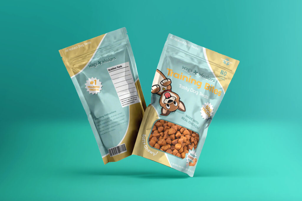
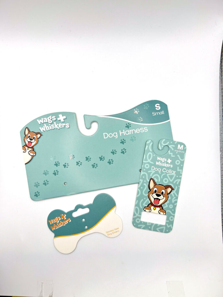
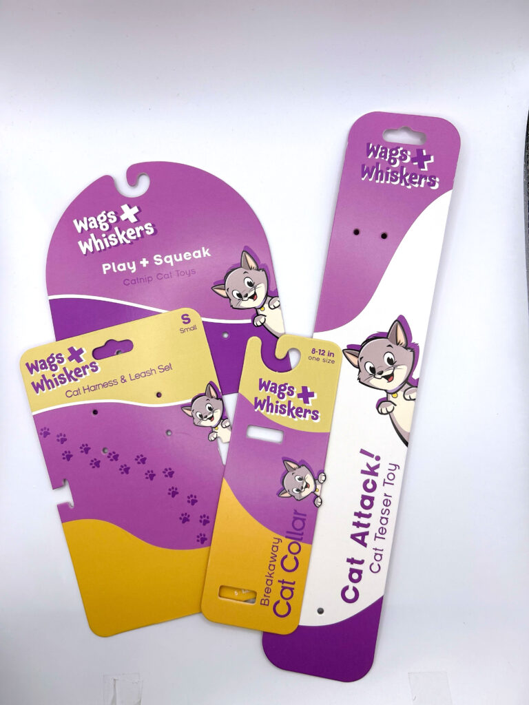
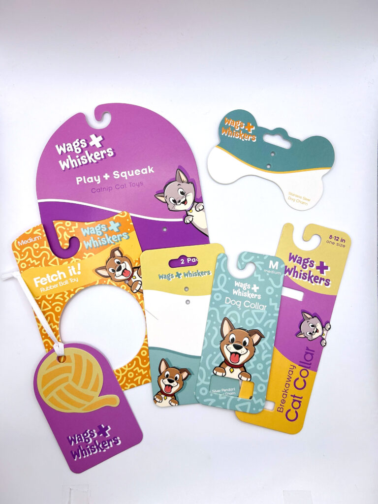
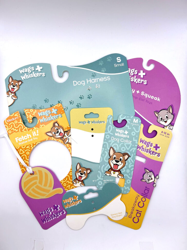
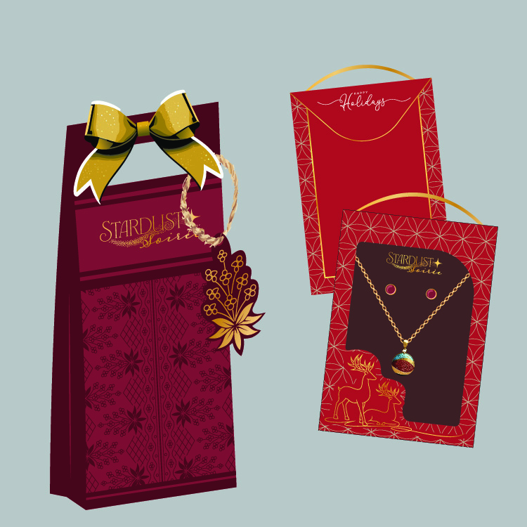
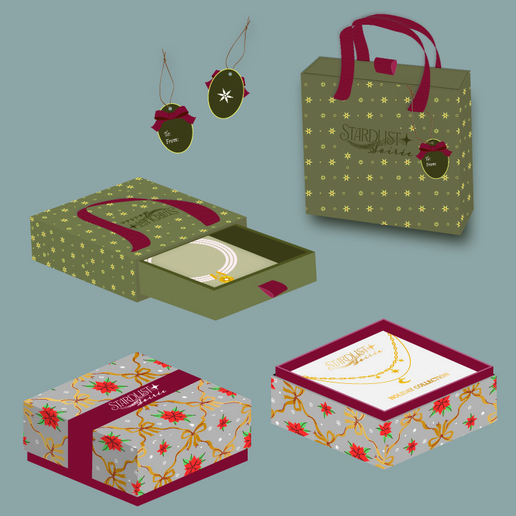
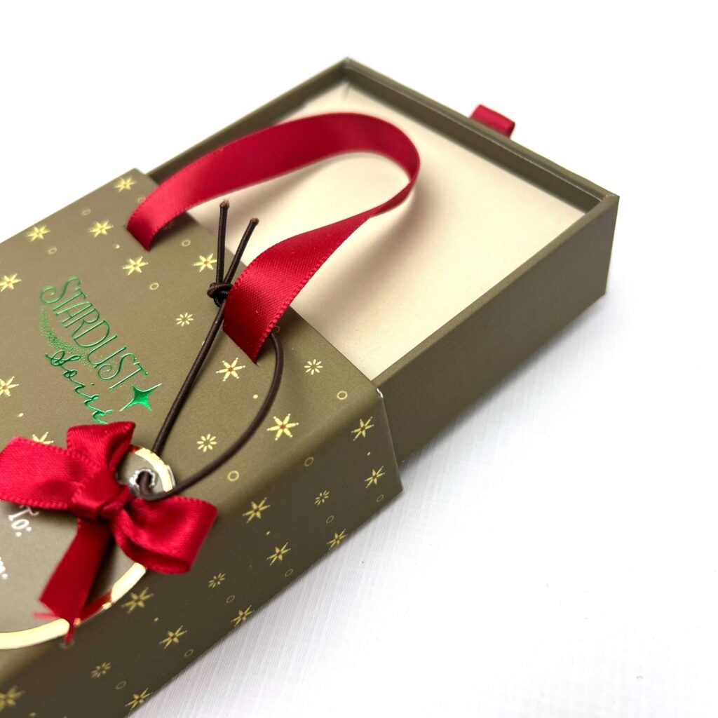
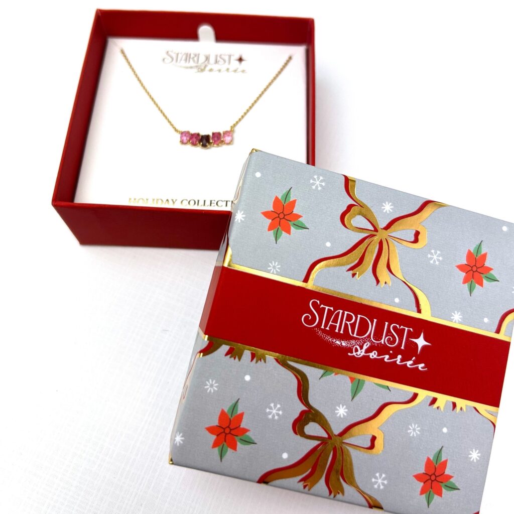
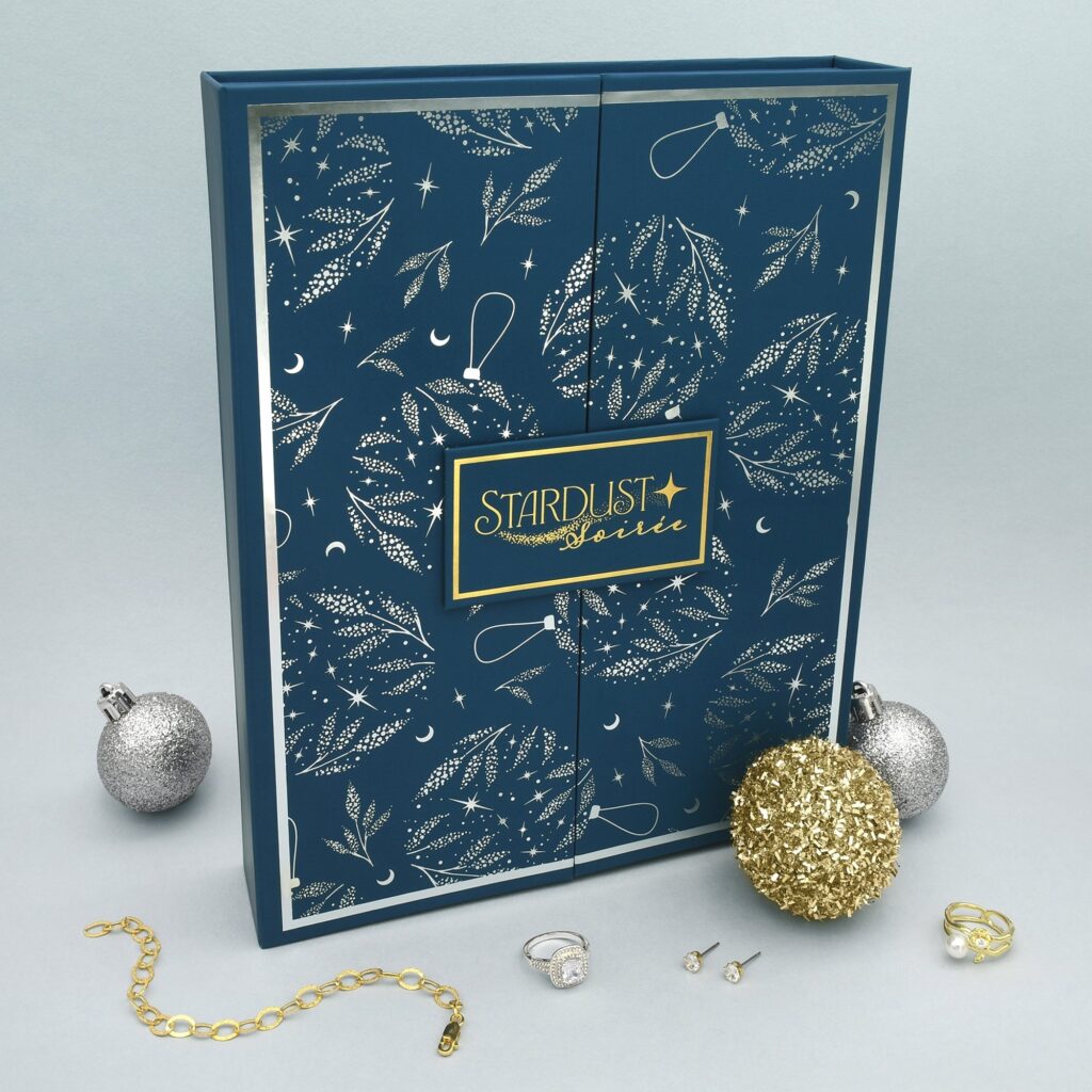
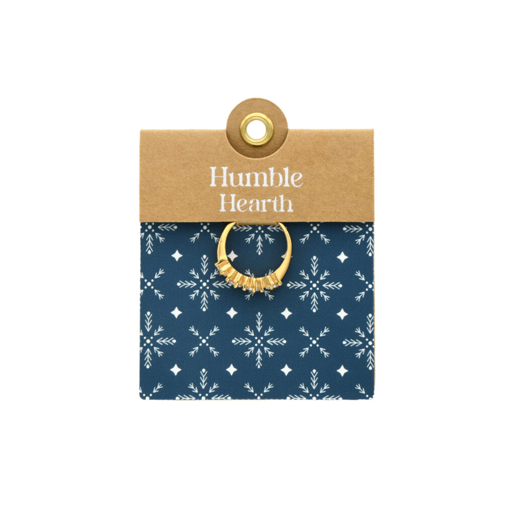
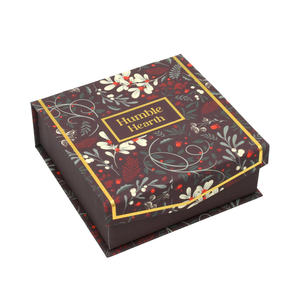
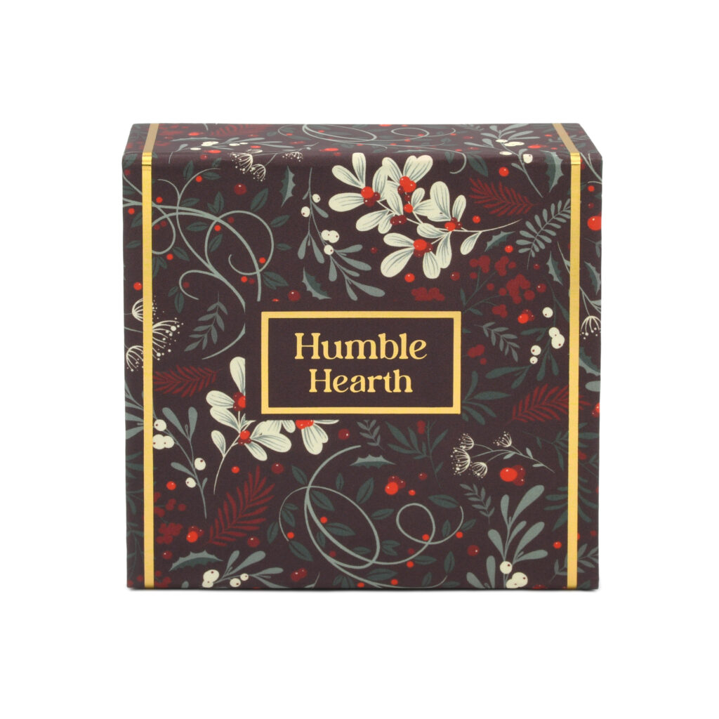
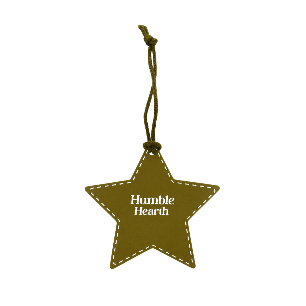
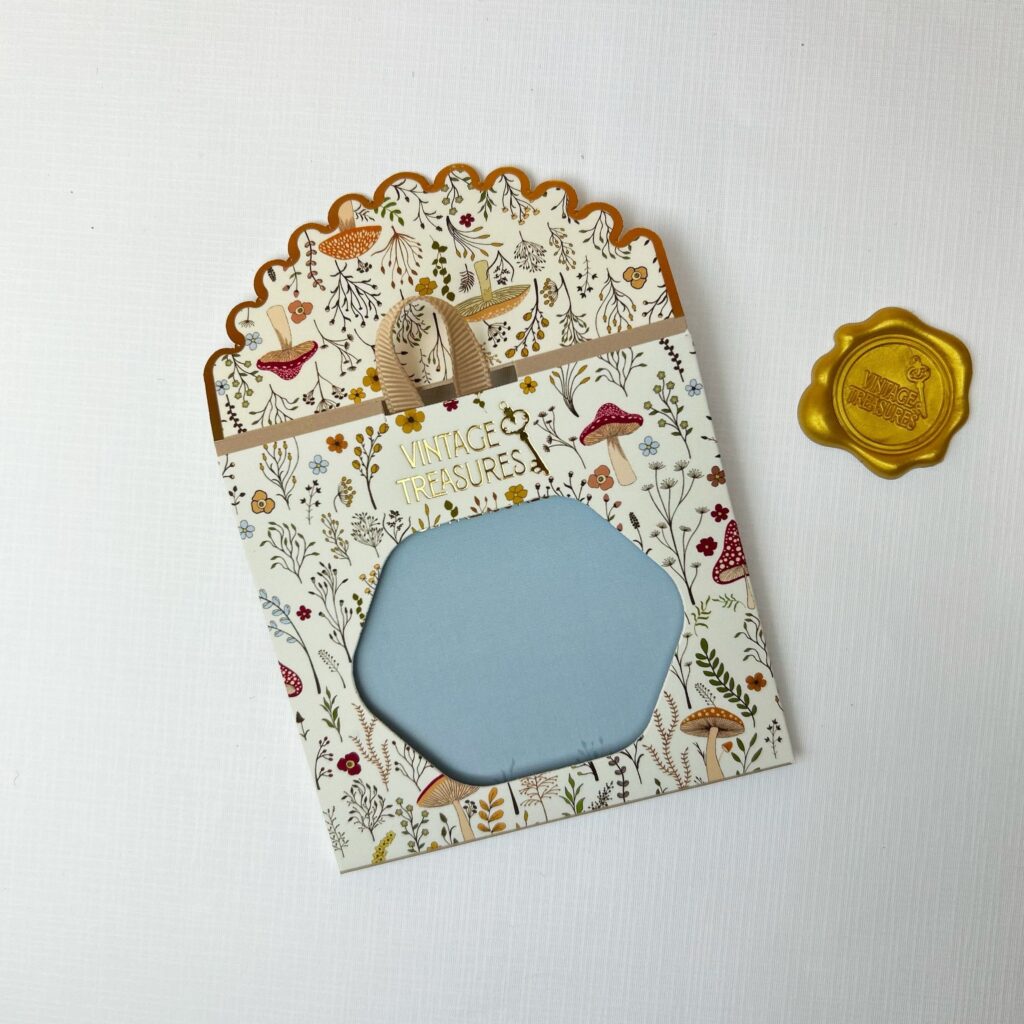
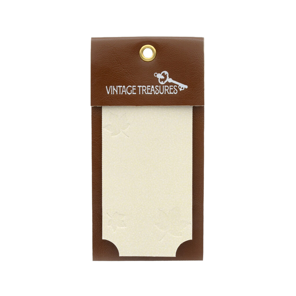
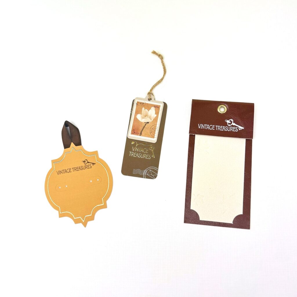
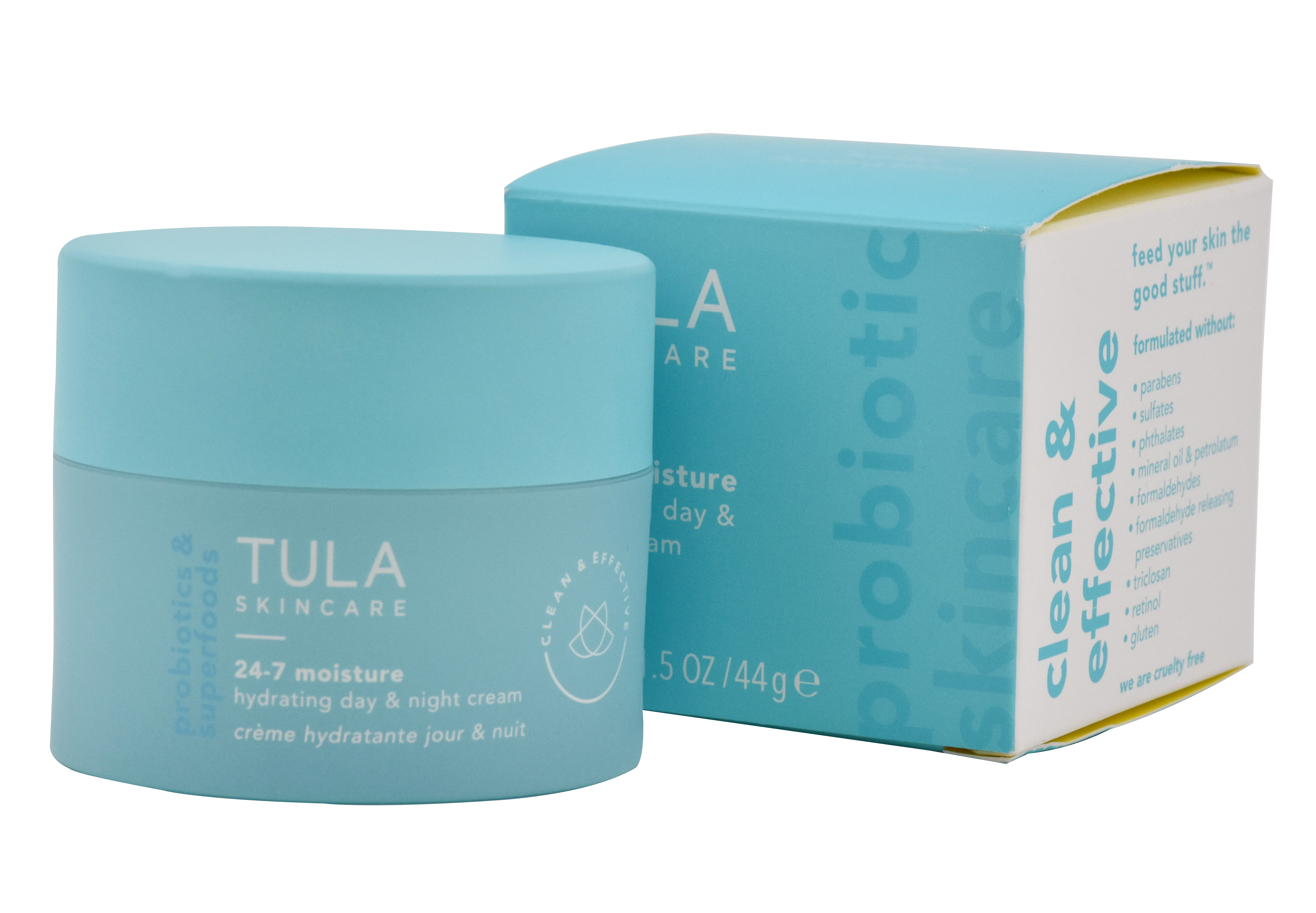
To solve the issue with the dropdown in the navbar of all of the products the company offers, I got rid of the dropdown completely and created just a “Products” page. This page then features all of the product packaging the company offers, with the addition of now showing images with each option so customers have a better sense of what they are looking for. Each product then links to their own page for more information on that specific product, making navigation easier and cleaner.


Additional Solutions
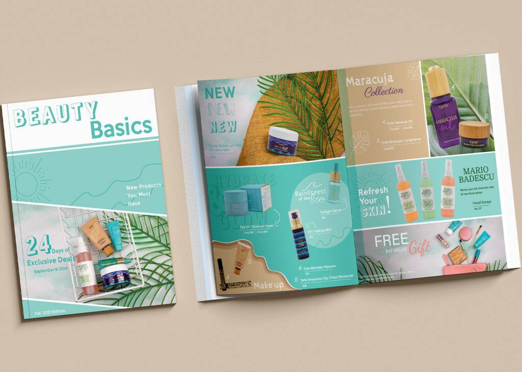
I noticed on the website they had a page full of all of their brochures and presentations available to download, with only the ability to scroll to get to which one you’re looking for.
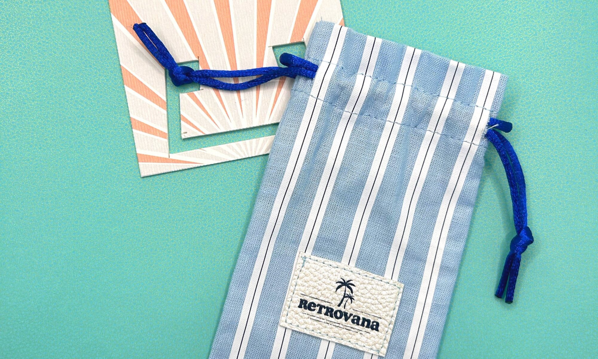
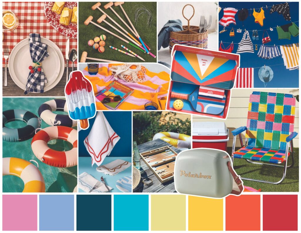
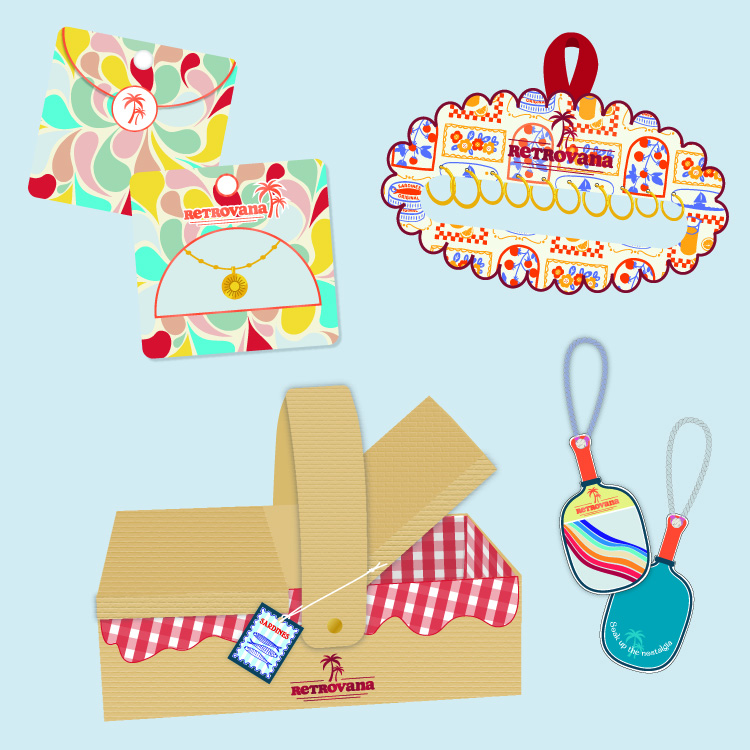
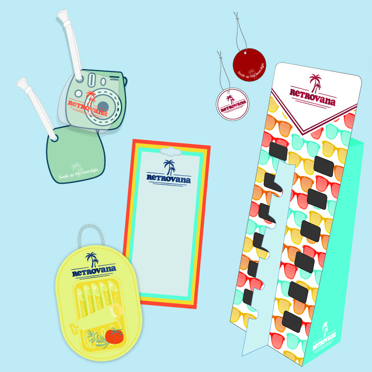
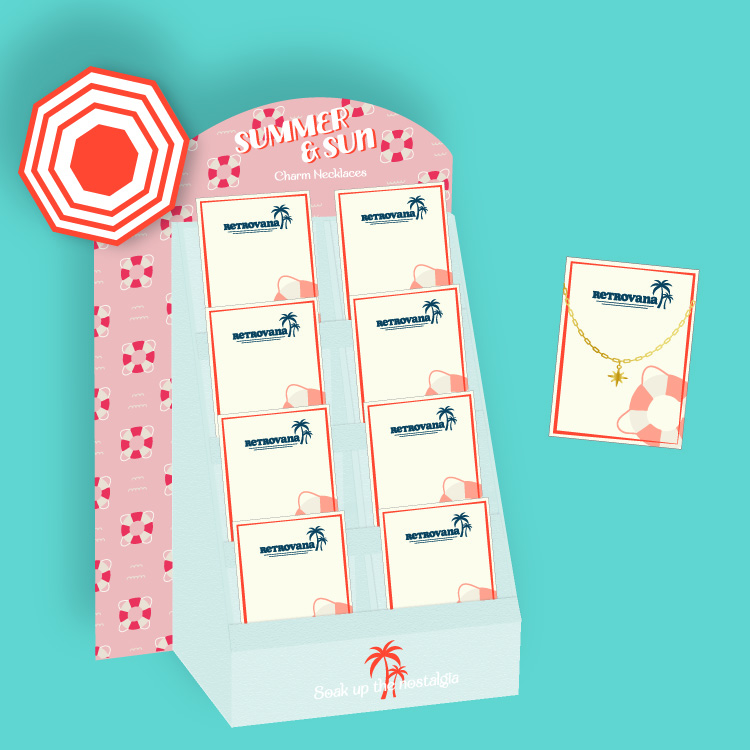
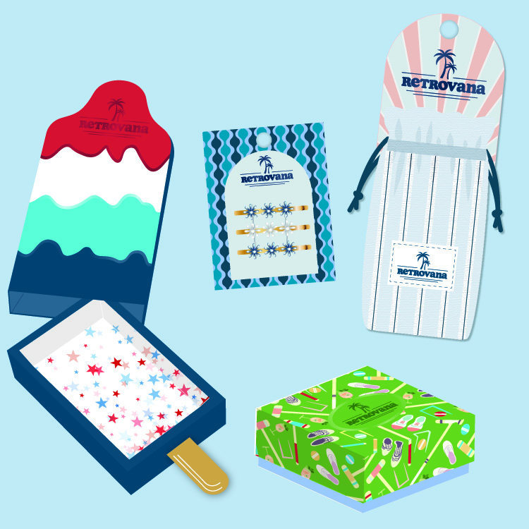
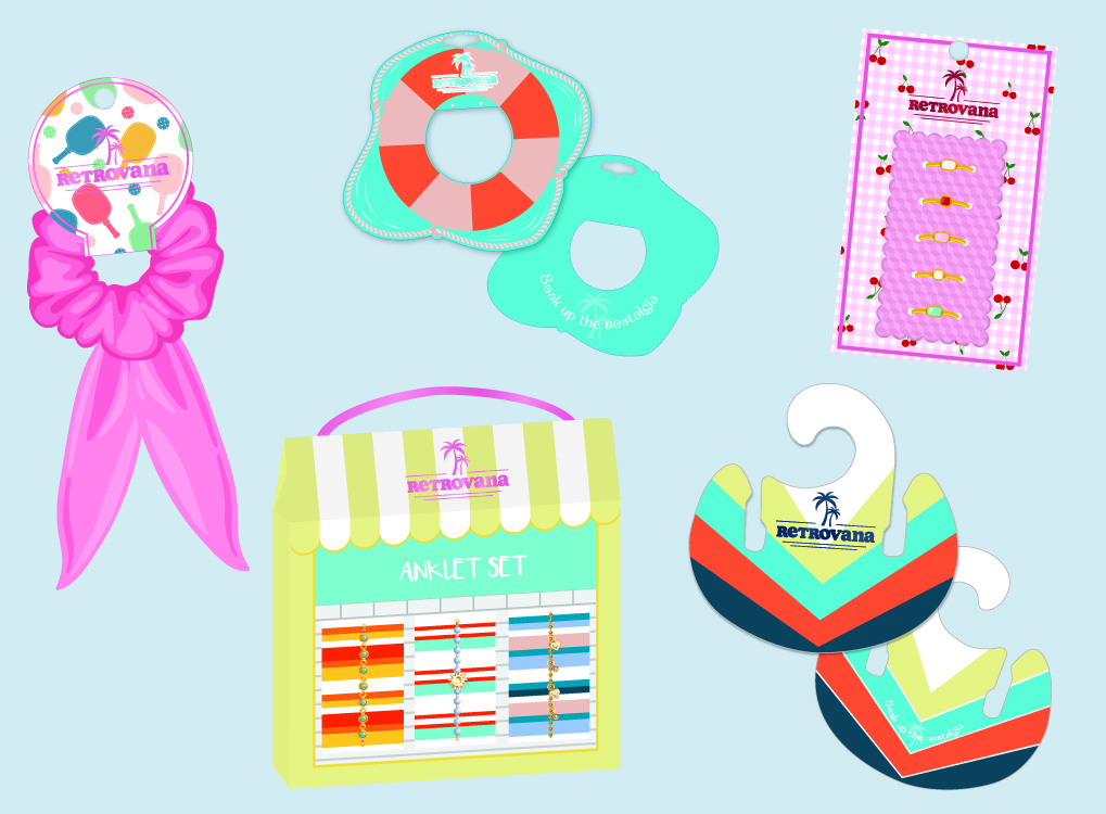
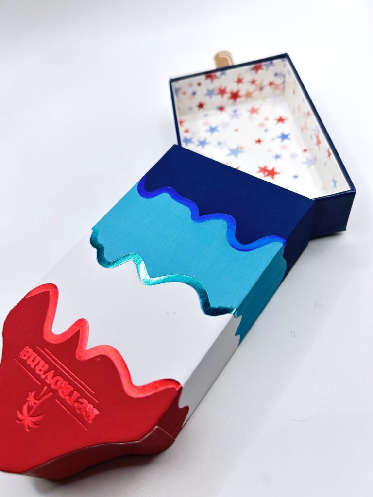
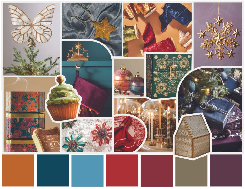
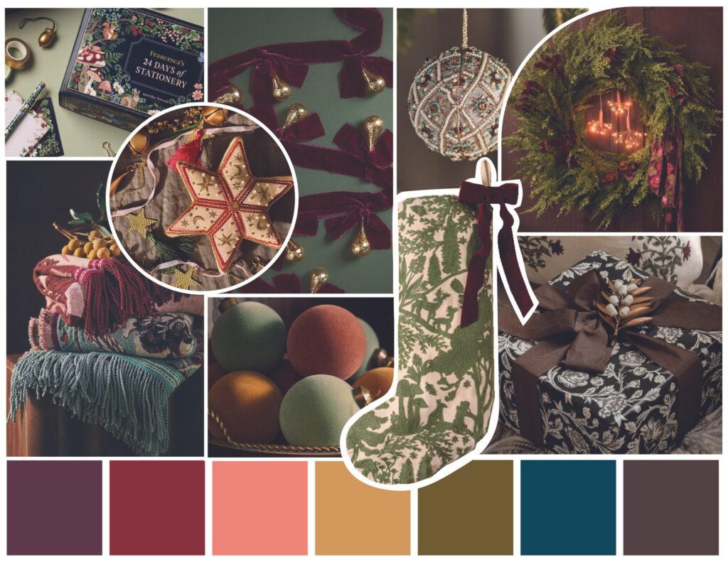
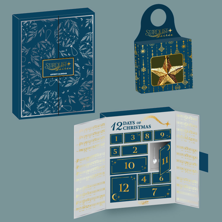
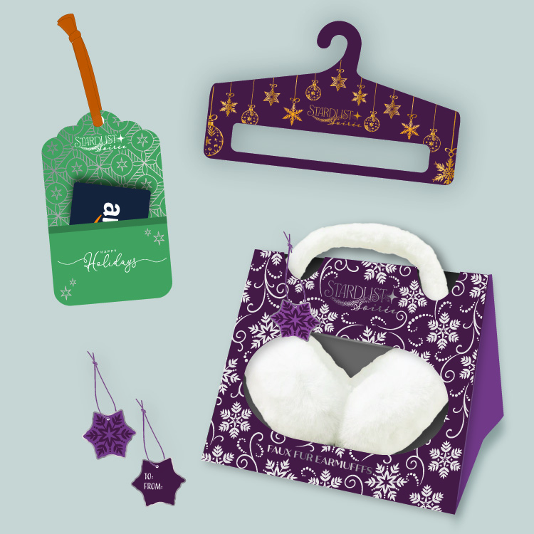
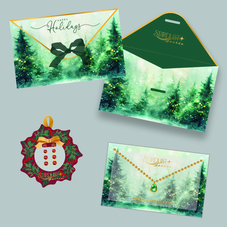
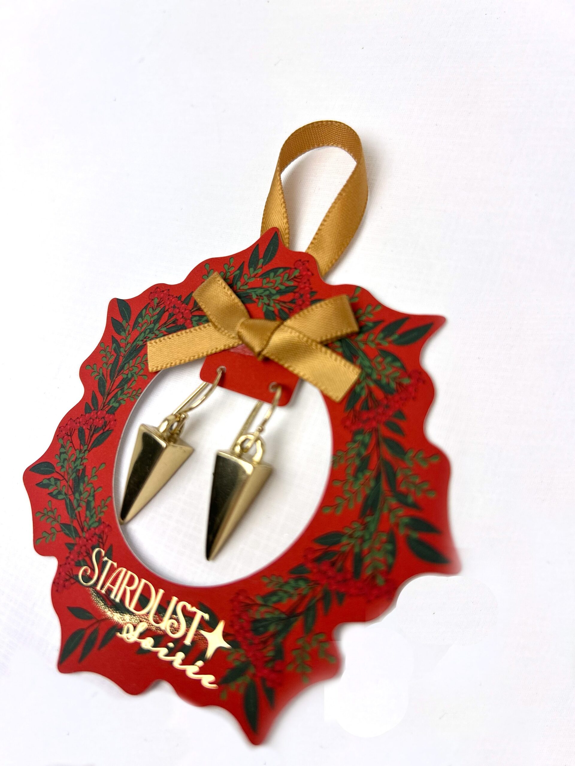
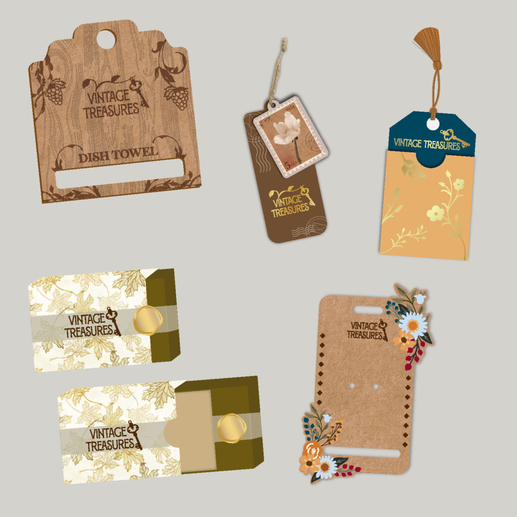
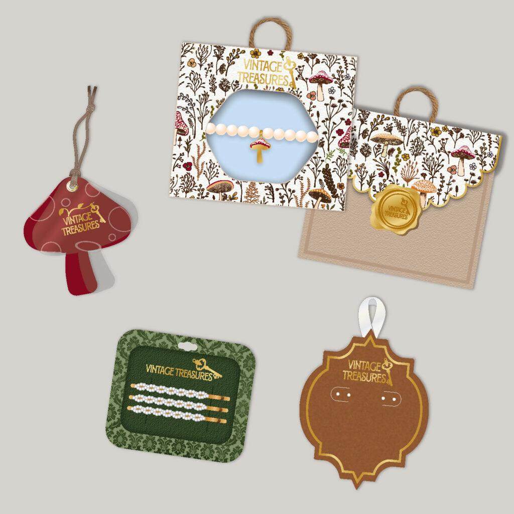
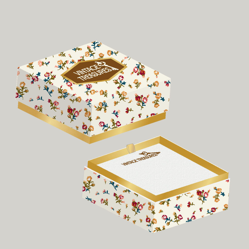
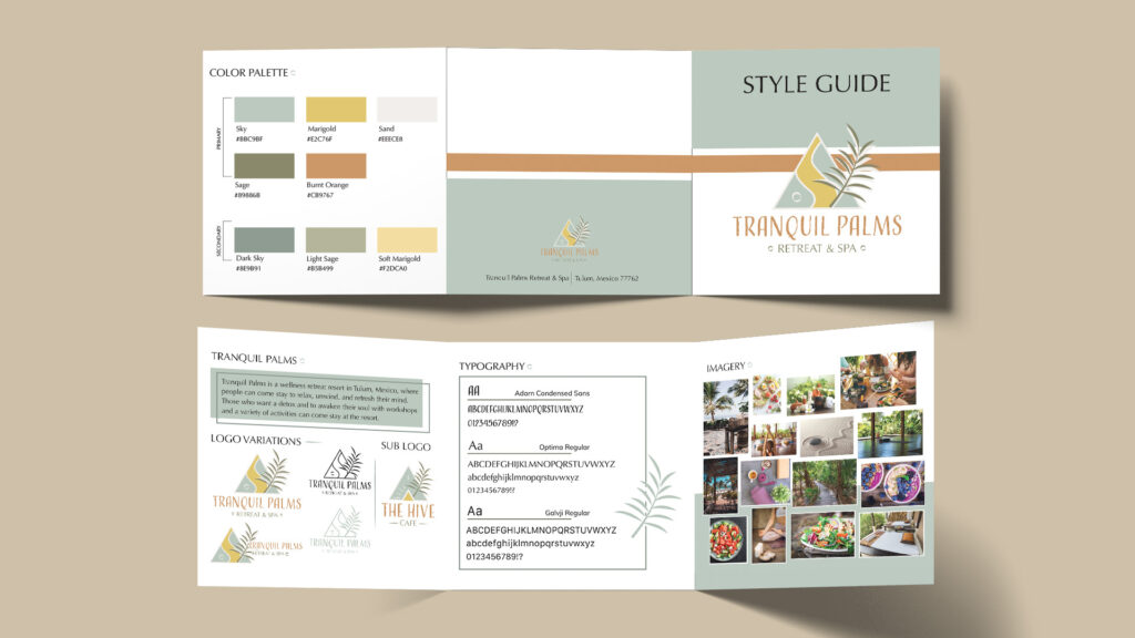
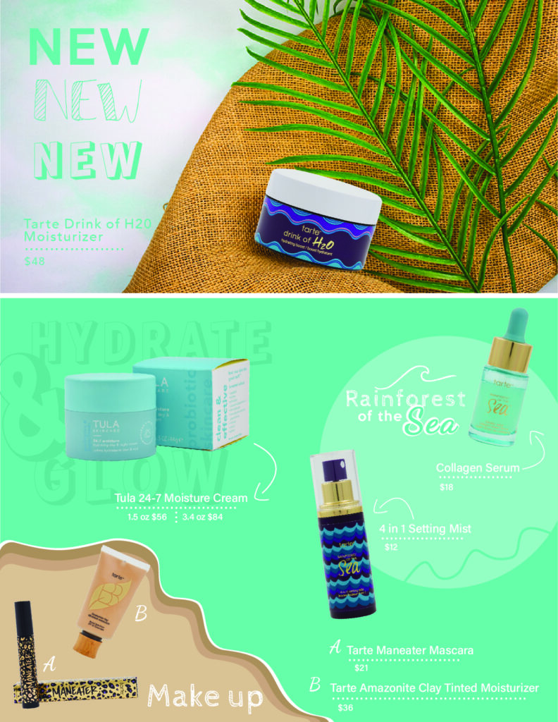
I fixed this by having each brochure on its product page for easier navigation, along with creating webpages for each season’s trending packaging, rather then landing pages that only lead to a brochure, they now lead to fully designed webpages with information on the trends, mood boards, photographs of the packaging, along with the option to download the presentation or watch a video created by our team on the trends and packaging we created.
Look through my full website redesign at aandhworldwide.com !