Wellness Retreat Branding

retreat branding logo

Wellness Retreat Branding

Overview

The project consisted of creating a fictitious brand of a wellness retreat resort, and creating an overall brand for the place. I designed a logo, style guide, brochure, menu, & welcome sheet. I also designed a branded lotion, cup, & tea.

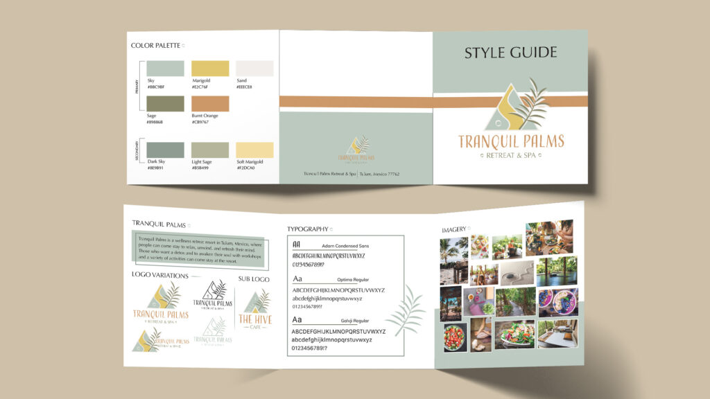
The fictitious brand created is Tranquil Palms. A wellness retreat located in Tulum, Mexico, that focuses on relaxing and refreshing minds and bodies of those who stay there. Activities there include various workshops to open minds and allow guests to feel comfortable in the space, along with yoga, trails, a beach, & spa.

Design Process

Logo

Tranquil Palms logo design wellness retreat branding
Tranquil Palms secondary logo design

When designing the logo, I wanted a relaxing affordance but also a tribal look to it for the location. I wanted soft colors that are easy on the eye and resemble relaxation. The logo design consists of a Palm in the icon for symbolization. The curve separating the triangle represents a Ying Yang, or relaxation like a river. I wanted the font to be tribal and unique, but easily readable.

Style Guide

The style guide is a complete representation of the brand. I included a small overview of the place, the logo versions, including the sub logo created for the restaurant, the primary and secondary colors of the brand, typography used for the logo and print formats, & imagery that best depicts the affordances of the brand.
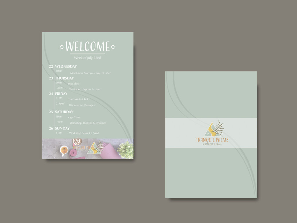
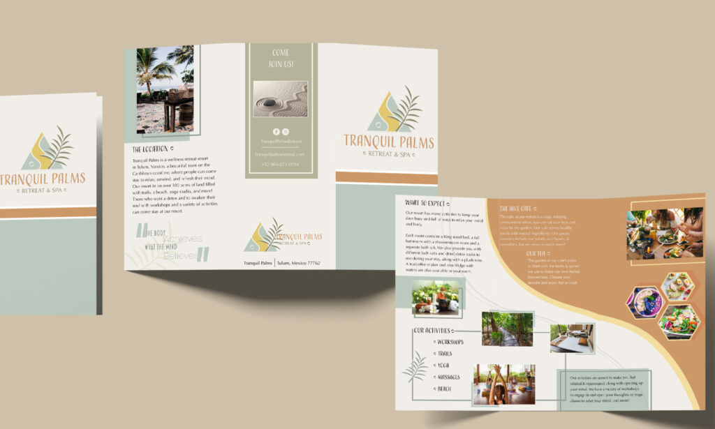
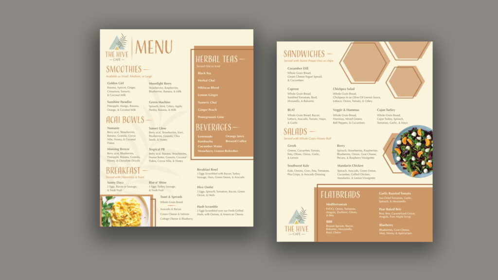
tranquil palms style guide

Print Designs

The print designs I created include the brochure, menu, & an activities sheet. I designed them all with the colors of the style guide and kept a cohesive element in all print designs, using the curve element from the logo and the circle in the logo as an accent to my headings.

welcome activities sheet for retreat design
brochure design for retreat
menu wellness retreat design

Package Designs

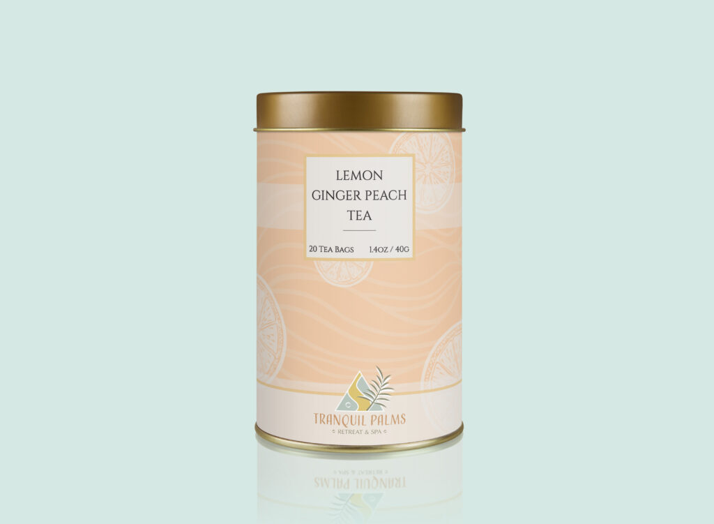
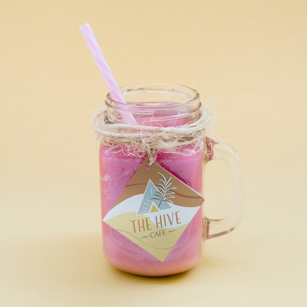
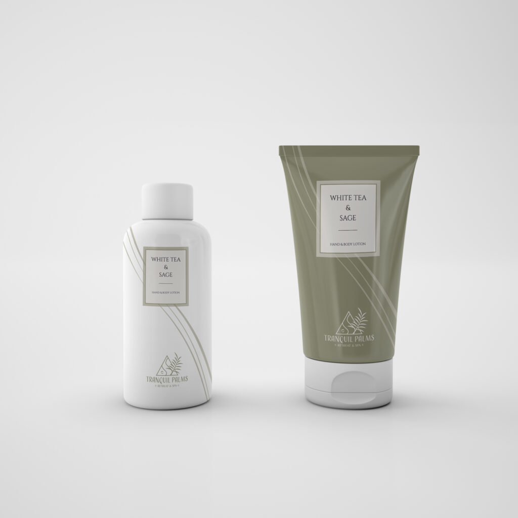
The package designs I created include two variations of lotion, a tag for the drink cups, & a branded tea tin design. I continued to use cohesive design elements in my package designs, the curved lines and other design elements along with the branding colors.

In the tea package design, I use a similar style of elements from the lotion package design to tie everything together. I wanted the design to resemble the flavor, with ginger leaves as the background, lemons, and a peach coloring.

tea box package design retreat brand
lotion mockups package design Tranquil Palms retreat
cup tag design for Tranquil Palms restaurant logo

Check Out More Case Studies!

Beauty Catalog Design

catalog spread design inspired by passion print design

Beauty Catalog Design

Overview

This project was to design a magazine page cover and spread, after photographing products in a light tent and also creating top down photography shots.

Design Process

Photography

The first steps were gathering the products and setting up the light tent to photograph the products with a white background. This gave good, solid, bright lighting on the products with a pure background to easily mask them out in Photoshop.

I also needed to take some top down photographs for content in the magazine layout. I tried multiple ideas with ways to display the products in an intriguing manner.

top down photography shot of beauty products for magazine layout
masked out product photography shot beauty catalog design

Page Design

Inside left page design of magazine layout

When designing the magazine spread, I wanted to focus on bright, vivid colors that complimented the products. I used typography to enhance the design by adding an opaque phrase behind a product and also using a mix of typefaces to focus on the Rainforest of the Sea Collection. When designing, I incorporated the makeup in a spill of foundation shades, but with the blue background it can also be seen as sand and the ocean for the Sea Collection.

Final Design Layout

catalog spread design

Check Out More Case Studies!

3D Model Magazine Cover

3d magazine cover

3D Model Magazine Cover

Overview

To create a 3D-Model based off of a magazine headline and complete a composition of a magazine cover with the model concept, using Cinema 4D and Adobe Photoshop.

Research

Finding the right story headline was a key factor in creating a good concept for a 3D-model. I did research on headlines based on topics I would be interested in, and found a story on a plant-based covid vaccine being approved in Canada. I then did research on the keywords of this headline to see what concepts I could come up with based off the headline.

Design Process

I started off by sketching concept ideas for the model. I wanted to incorporate a syringe for the medical aspect along with a leaf for plant-based. I tried a few different ideas incorporating a beaker or the cartridge that holds vaccines, but ended up with a leaf and syringe. I later thought of the idea of using a maple leaf, the Canadian symbol, as the leaf in the model to symbolize that the story is based on Canada. As this may not come across to everyone who views it, it is a great concept for the model to tie it together. 

3d model option sketch
3d model magazine cover sketch

Challenges & Solutions

Once I had the overall concept ready, I began creating the model in Cinema 4D. There were a few challenges during the creation in terms of what style to use and finding the best way to create certain shapes for the most precise outcome. I also came across challenges when lighting the composition with the materials on the objects. This was difficult to bounce the lighting on the glass of the syringe, getting rid of the shadows or over exposure.

To make the items precise, I used a lathe tool to create the base of the syringe, making it a perfect symmetrical shape. I also added more area lights to the composition to make the glass look better, and blocked the liquid inside from reacting to the light so it doesn’t glow or reflect. 

composition of 3D model for magazine cover in Cinema 4D

Composition

When creating the final composition with the model inside the magazine cover, there were a few things to consider. I chose The Scientist to be the company for my magazine headline as it is a story from them and best fits the title. I kept the same style they typically use. 

When framing my model in Cinema 4D, I had to consider the angle and size proportions when creating my shot. I wanted the syringe on an angle and it to be a front view but not head on. 

Outcome

Here is the final composition with the 3D model on the magazine cover layout created in Adobe Photoshop and 3D model created in Cinema 4D. 

final outcome of 3D model and magazine cover layout.

Check Out More Case Studies!